


Royal Portraitists Have Lost the Plot
Reviewing a new likeness of the Princess of Wales

No, this isn’t another thinkpiece or critique on the new portrait of King Charles III.
Before we begin, though, can we all first come to terms with the fact that “critique” isn’t actually a dirty word? In literature and art, it literally just refers to a detailed, thoughtful analysis—not an attempt to tear anyone or anything down. Although I realize that asking people on the internet in 2024 to be “thoughtful” is probably not the greatest hill for me to die on.
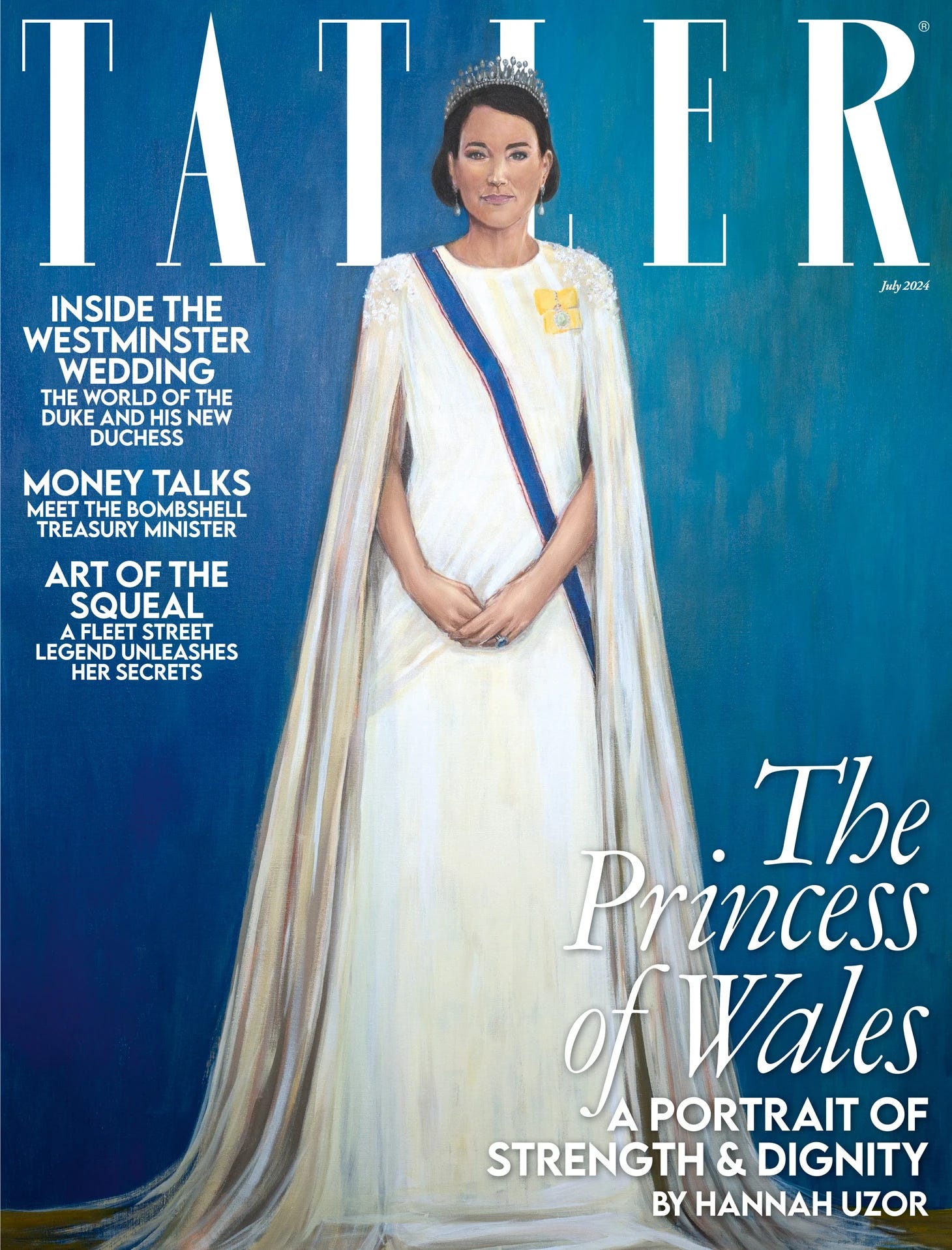
Because I need you to hang on to that definition in your mind as there’s a new royal portrait in town: one of Catherine, Princess of Wales. It’s not an “official” royal portrait—meaning it wasn’t officially commissioned by the Palace—but as it’s the closest thing we’ve had to a Kate sighting since she announced her cancer treatment, I expect it to make some waves online.
Add in the nature of the commission and the…er, creative approach to the Princess’s likeness? I can already feel my eye twitching from the bevy of hot takes that are about to flood our social media timelines. But, art history degree-possessor that I am…critique I must.
Let’s seek to understand this new royal portrait from bottom to top, beginning with…
Who asked for this?
The portrait was commissioned (i.e. ordered and paid for) by Tatler, a British society and lifestyle magazine. Many royal watchers will know Tatler for its 2020 puff piece titled Catherine the Great: How the Crisis Made Kate the Kingmaker. This article (which concluded that Kate was the monarchy’s ultimate power player, but also included unflattering statements about the Middleton family and Kate’s weight) prompted Kensington Palace to launch legal action and issue a rare public comment claiming that the piece contained “a swathe of inaccuracies and false misrepresentations which were not put to [them] prior to publication.”

Tatler’s editor-in-chief stood behind the reporting and resulting story, but an edited version ultimately appeared online—signaling the publication’s acquiescence to KP’s demands. The overall sense, echoed by sources close to publisher Condé Nast, was that the mag’s “long-standing relationship with the Royal Family” led to editors wanting to “end this amicably.”
Indeed, Tatler is best known for its access to high society figures to pose for cover shoots (like Sophie Winkleman, Lady Frederick Windsor). As a result, it stands to reason that they will always err on the side of flattery when it comes to the Royal Family in order to preserve that access.
Today, Tatler revealed its July 2024 cover, which comprises their third annual portrait of a member of the British Royal Family. In 2022, to celebrate the Platinum Jubilee, Tatler commissioned a portrait of Queen Elizabeth II. This was followed in 2023 by a coronation portrait of the newly crowned King Charles III. Both were completed by Commonwealth painters: Nigerian artist Oluwole Omofemi and Trinidadian artist Sarah Knights, respectively.
These portraits gave traditional depictions of the two monarchs a welcome twist: vibrant pop art for the Queen, and a candor akin to a courtroom sketch for the King. What I found so successful about these commissions was the way that they allowed Tatler’s audience to experience an alternative view of the Monarchy’s central players. It was as if the artists, from their unique positions as members of the Commonwealth, were letting us borrow their cultural lens. The effect was by no means unflattering to the subjects, and I viewed this series as a breath of fresh air in royal portraiture.
Who is the artist?
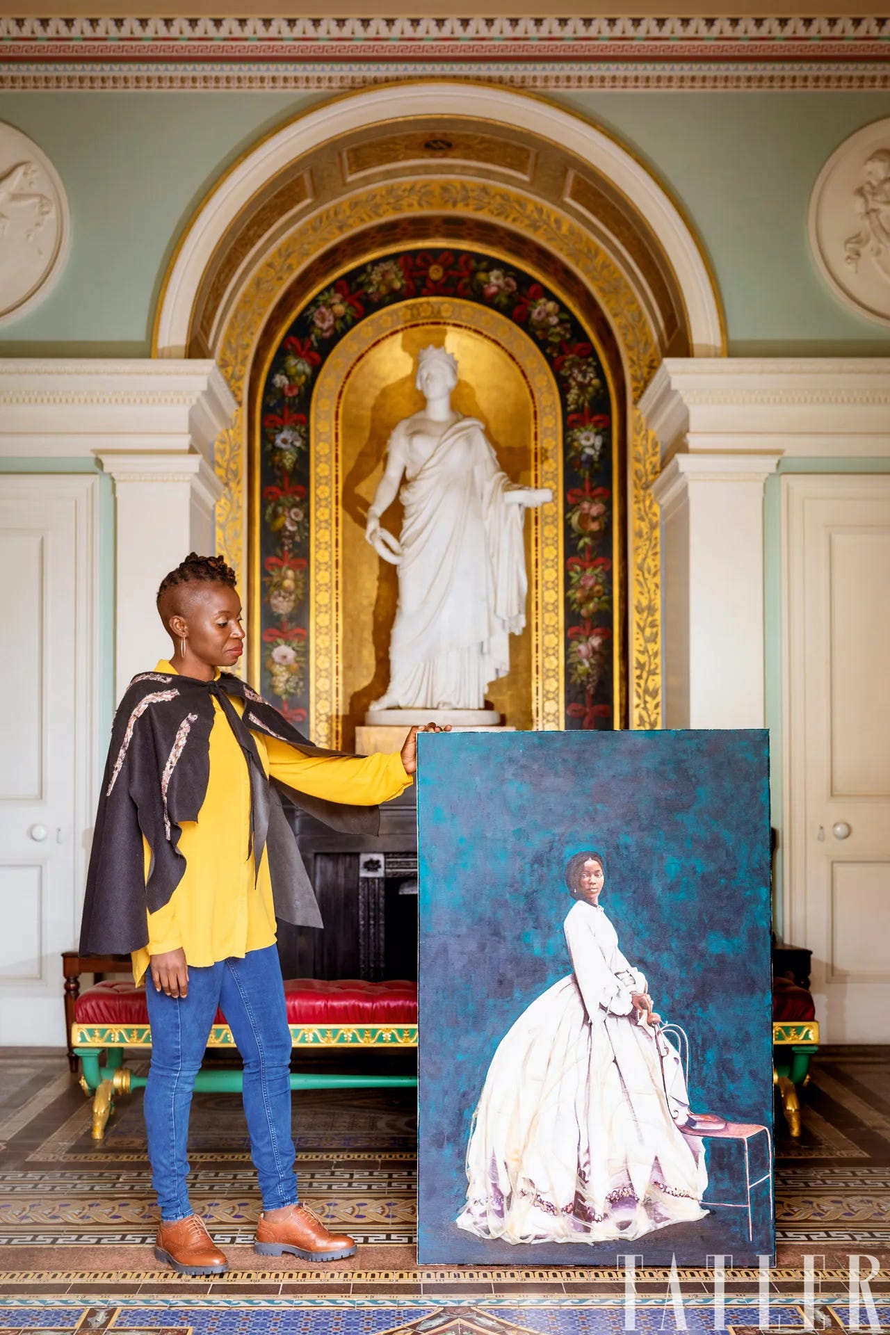
The new portrait of Catherine was completed by British-Zambian artist Hannah Uzor. Her name should be familiar to listeners of my podcast, Art of History; Uzor also received a commission from English Heritage in 2022 to produce a portrait of Sarah Forbes Bonetta, an African goddaughter of Queen Victoria. (Listen to the episode here).
This widely praised portrait was part of a project to “highlight historical figures of the African diaspora who had played a part in English history and the complex relationships they had with Victorian society.” The painting went on to be exhibited at Queen Victoria’s summer home on the Isle of Wight, Osborne House.
Many of Uzor’s subjects are members of the African diaspora. An equally central part of her artistic practice is “driven by her interest in history, particularly diasporic culture and its manifestation in personal and public memory…Each body of work is centered on a particular research focus, drawing from a variety of references, including archival images, historical paintings, family photographs, and literature.”
Uzor works with acrylic paints and pays particular mind to the backgrounds chosen for her subjects, which are often monochrome washes of color. For Kate’s portrait, she chose a green-blue “based on her eye color and also trying to get elements of being in a garden and on the water—rowing being one of her [favorite] sports and in some pictures.”
But as for why, specifically, Uzor was selected for Tatler’s portrait of Kate, the best the cover story has to offer is: “Who better to paint her than fellow mother-of-three, British-Zambian artist Hannah Uzor?”
That’s sort of what you’re supposed to be telling me, Tatler.
In the magazine’s profile of Uzor, the overlapping characteristics between the artist and subject are emphasized: Aside from having the same number of children, “both women appear to juggle family life and high-achieving professional roles with a skill that belies this complexity.”
Uzor is also quoted as “expressing huge admiration” for the Princess of Wales:
“She has really risen up to her role – she was born for this. She carries herself with such dignity, elegance and grace.”
Given that we are discussing a magazine that caters to a largely white, upper-class audience, the choice to continue Tatler’s “tradition” of tasking an artist of color with a royal portrait gives plenty of food for thought. I find it particularly intriguing given last year’s “race row” headlines, which overwhelmingly focused on Kate as the perpetrator of racist comments about Prince Harry and Meghan Markle’s children. If headlines could claim that Kate and Charles attending events together in the wake of those allegations was a “show of unity,” I don’t think it’s at all presumptive to also suppose that Tatler would view a black artist painting Kate’s likeness as a having similar “unifying” effect.
As we’ll see, there are layers here. Not just in Hannah Uzor’s approach to depicting the Princess of Wales, but also in her focus on Kate’s ability to “rise above.”
What was the thought process behind the portrait?
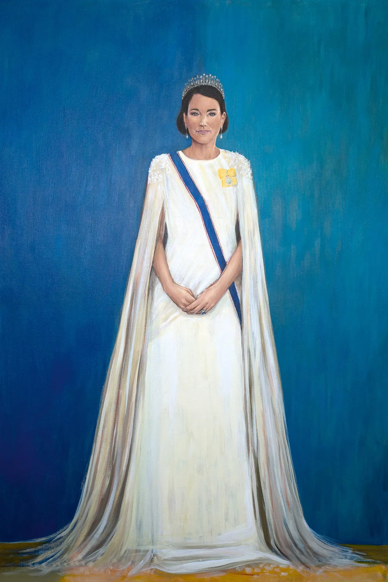
As this was not an “official” royal portrait commission (meaning it was not sanctioned by the Palace), Uzor would not have had access to in-person sittings with the Princess of Wales, even under normal circumstances. (Kate continues to recuperate at home as she undergoes preventative chemotherapy, Palace sources advised this week.) Uzor relied on the “189,000 pictures of the Princess of Wales in the Getty Images archive” to get a sense of Kate, “before basing the final work on a composite image.”
And here’s where I will acknowledge the thought that’s probably been on your lips from the moment you saw this portrait: it doesn’t look like Kate at all.
Uzor’s portraits, in general, place “a lot of emphasis on how both the visible and invisible parts of a character can be revealed through a painting.” In a word, layers.
She notes, “When you can’t meet the sitter in person, you have to look at everything you can find and piece together the subtle human moments revealed in different photographs: do they have a particular way of standing or holding their head or hands? Do they have a recurrent gesture?… All my portraits are made up of layers of a personality, constructed from everything I can find about them.”
This is a method that undoubtedly works well when the artist is limited to archival photographs of a long-deceased subject—like Sarah Forbes Bonetta, who died in 1880. We know how she appeared in the handful of staged photographs that she posed for during life, but we don’t know how she would have appeared in an everyday setting. We do know those things about Kate.
Interestingly, to fully capture the Princess of Wales for this portrait, Uzor even referenced the March video in which Kate announced her cancer diagnosis; she says it showed Kate in “a moment of dealing with something difficult, speaking from the heart, having the courage to tackle it head-on.”
With Kate’s likeness, it seems that Uzor was specifically trying to capture “the dichotomy between the public persona and the private.” A straightforward, photorealistic portrayal of the Princess of Wales could have accomplished this, if Uzor had based it on a well-chosen, candid moment captured on camera. But that’s clearly not the route the artist has chosen to take.

Remember those keywords that Uzor dropped while expressing her admiration for Kate? “Dignity, elegance, and grace?” They’re also echoed in the official title of the piece: The Princess of Wales - A Portrait of Strength and Dignity.
Such flattery seems to be a prerequisite for any artist looking to land a commission for royal portraiture—which makes sense if you bear in mind that the goal of an official royal portrait is not far off from “propaganda” territory! But we aren’t getting an “authorized” portrait from Uzor, are we? Tatler is a third-party, theoretically unbeholden to the constraints of making the monarchy look good.
Theoretically, that is, when the organization paying for the portrait doesn’t also owe its success to continued access to high society circles. In practice, this portrait coming from Tatler and featuring Kate as its subject was never going to be particularly provocative or even interesting, artistically-speaking.
And if I were to play devil’s advocate, I’d go the extra mile and also say that accuracy wasn’t even part of the brief for Uzor. This isn’t supposed to be a realistic depiction of Kate. If this portrait is somewhat vague and neutral, that’s because the goal was to reinforce the Princess of Wales’ popular image as even-keeled and unflappable above all else.
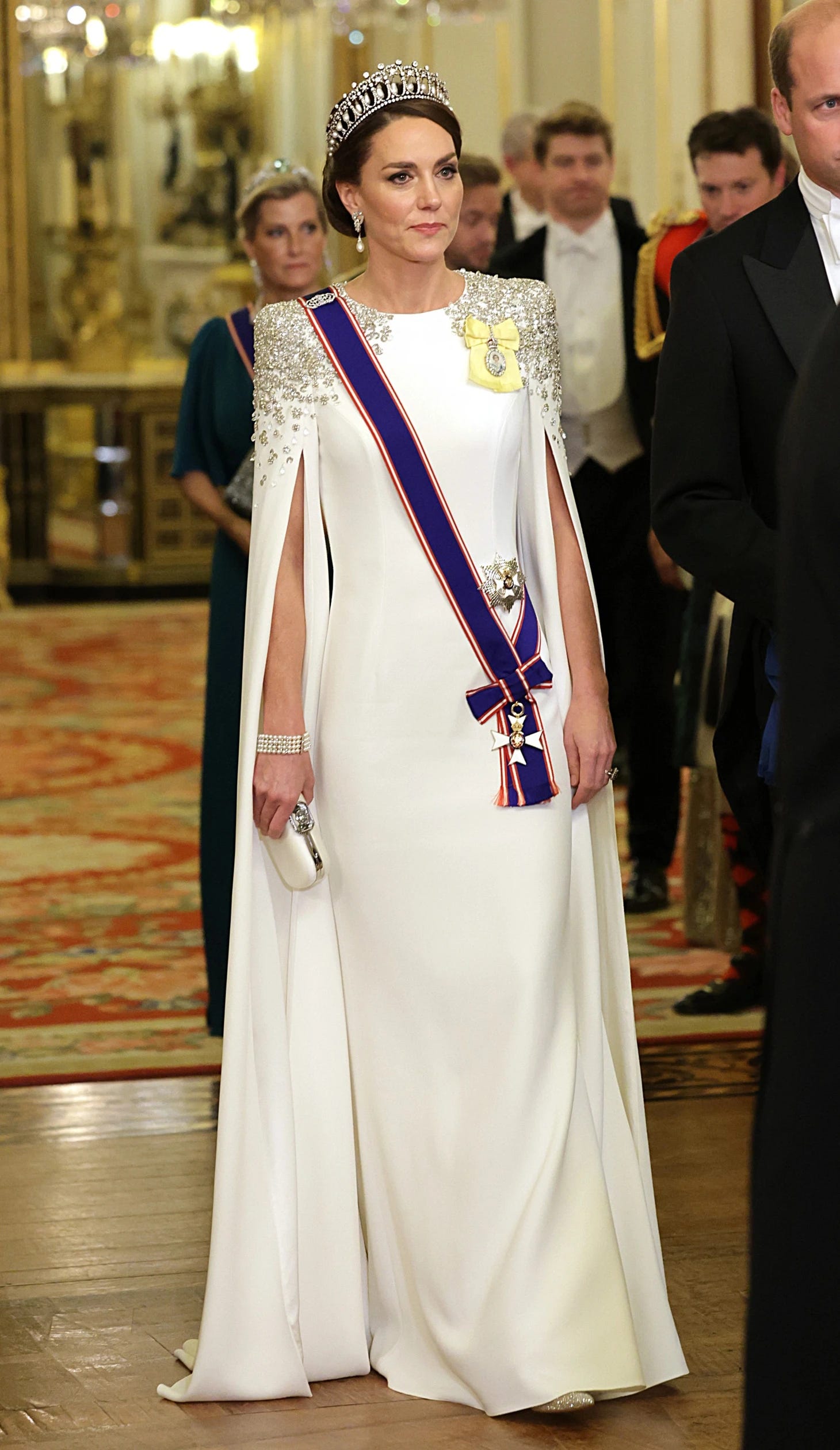
Uzor’s painting doesn’t even have to look exactly like Kate for us to know that it’s her. The choice of costume for the Princess—a white Jenny Packham gown worn for the 2022 State Banquet in honor of South Africa—paired with the Queen Mary’s Lover’s Knot tiara. We’ve seen these items on Kate so many times that they, themselves, have become symbols for the Princess. A likeness of any slim, brunette woman wearing them will immediately be understood as a likeness of Kate herself.
And I don’t blame Uzor for taking this approach. After all, it’s a visual tactic that actually mimics Kate’s style strategy. It’s also closely linked to that typical portrayal of her that we find in written media; keep the details about Kate’s personhood as vague as possible, allowing as many British subjects as possible to find ways to identify with her.
But I think we can now conclude that this neutral, tepid approach to capturing “the person behind the crown” doesn’t always translate to a visual medium. Whenever an artist makes such an attempt, while also trying to maintain royal favor, people buck at the result.
Think back to another infamous solo portrait of Kate: the 2013 “Vasilene-lensed” portrait of her when Duchess of Cambridge. This one was an official palace commission, and it now belongs to the collection of the National Portrait Gallery. But the likeness was universally criticized as uncompelling, unflattering, and void of any actual human emotion. In this piece, Kate stares vaguely out of the canvas with a smile that should be compelling…but one that is more likely just a refusal on the subject’s part to reveal too much.
Uzor’s portrait definitely suffered from some technical issues—probably due to a “composite image” of Kate not actually mimicking the popular image that most people—the artist included—have of her. People don’t want contrived images of the royals when HD-quality, detailed photos of them are only a click away.
I’m yearning for some symbolism here! What happened to the days when royal portraits contained references to territories and titles, passions and values? Give me an interesting setting, a compelling artistic technique! I swear, I’ll become an instant stan of whichever modern royal has the stones to ask for an honest-to-god memento mori in their next official portrait.
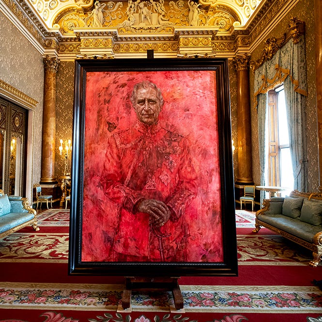
At least Jonathan Yeo’s portrait of King Charles had these elements. For all its shock value, it was a rich text, enabling us peasants to have discussions around meaning and symbolism and intent. But if Yeo’s painting took things too far (I maintain that an art history degree should not be a requirement in order to understand a royal portrait), then Uzor’s has the opposite problem.
Princess Kate in an evening gown? Super. Another earnest celebration of virtue based on Palace press releases? Groundbreaking.
The Princess of Wales - A Portrait of Strength and Dignity is, for all its supposedly “layered” depiction of its royal subject, entirely too surface-level; Uzor was either afraid of or uninterested in deviating from the universally approved KP talking points about Kate’s elegance and grace.
Uzor’s work has always resonated with me whenever I’ve encountered it before. When she’s painting a subject that none of us are likely to feel that we personally know, I think her approach of synthesizing heaps of photographs, historical accounts, and primary sources works well—like with her depiction of Sarah Forbes Bonetta. But we, collectively, have a complex relationship with the Princess of Wales, one that confuses the artist’s task in depicting her. We consistently clamor for more when it comes to Kate and feel that we can never consume enough about her, but we also don’t want to know too much, lest the magic of the monarchy disappear. Uzor was handed an impossible task with this royal portrait.
One last bananas detail that I have to highlight: the Tatler story also reveals that Uzor had just three weeks to complete this commission. That’s a truly insane window for a royal portrait—let alone one that will be touted on magazine covers. I’m truly befuddled by the quick turnaround time here. Were there other artists consulted for the project before Uzor? Was a previous, more provocative version of this portrait scrapped in the interest of not ruffling feathers during Kate’s cancer treatment?
Whatever the reason for the short window for delivery, Uzor was evidently game, and she claims that it actually worked with her artistic process: “I work quickly…Once I start painting, it will only take me two or three days.”
So, I’ll leave it with you: what do you make of this royal portrait? Why do you think Uzor was chosen as the artist? Should we consider this piece differently than we would a more traditional commission, given its “unauthorized” status?"
I wonder - was the artist, who, when asked to quickly produce a piece showing Kate's strength and dignity, created a portrait that looked nothing like Kate, trying to make a point by making a portrait that could be an illustration of any princess in a child's story book?
Honestly before I saw the headline I assumed this was a portrait of Queen Mary of Denmark because facially that's who it resembles to me